Subzero
Building one shared design language for 50+ digital products at Axis Bank
DESIGN SYSTEMS
ACCESSIBILITY
Role
Product Designer
Timeline
JUN 2021 — AUG 2023
team
2 PRODUCT DESIGNERS (including me), DESIGN SYSTEM LEAD, 3 ENGINEERS, 2 QA ENGINEERS
platform
Audit · Component Design · Accessibility · Governance
The Real Problem
FROM FRAGMENTED INTERFACES TO A SHARED FOUNDATION
During discovery, I audited existing Axis Bank experiences and looked at how teams were interpreting the bank’s existing brand guidelines across digital products.
The guidelines had originally been created primarily for brand and print applications, leaving product teams without a comprehensive framework for digital interaction. As different teams solved similar problems independently, we found inconsistent UI patterns, duplicated solutions and variations in navigation and component behaviour.
This helped us identify that we didn’t just need a UI library. We needed a shared digital language that could give designers and engineers a common starting point while improving consistency, accessibility and efficiency across products.
What I did
AUDITED EXISTING PRODUCTS
Reviewed existing interfaces to identify recurring patterns, inconsistencies and duplicated solutions.
IDENTIFIED SYSTEMIC GAPS
Compared product experiences against the existing brand guidance to understand where digital standards were missing.
SYNTHESISED PATTERNS
Grouped recurring issues across products to distinguish isolated UI problems from system-level problems.
FRAMED THE OPPORTUNITY
Helped define the need for a reusable digital system rather than continuing to solve inconsistencies product by product.
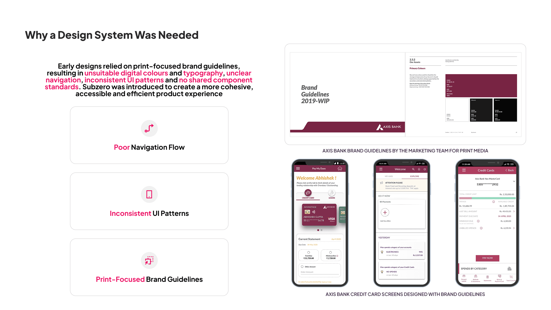
The existing guidelines were primarily designed for brand and print, leaving teams to interpret digital patterns independently. This resulted in inconsistent navigation, UI patterns and product experiences across the bank.

We created Subzero 1.0 as a shared starting point for digital teams, introducing foundations for colour, typography, spacing and layout. It established initial consistency while giving us a way to learn how teams would use the system in practice.
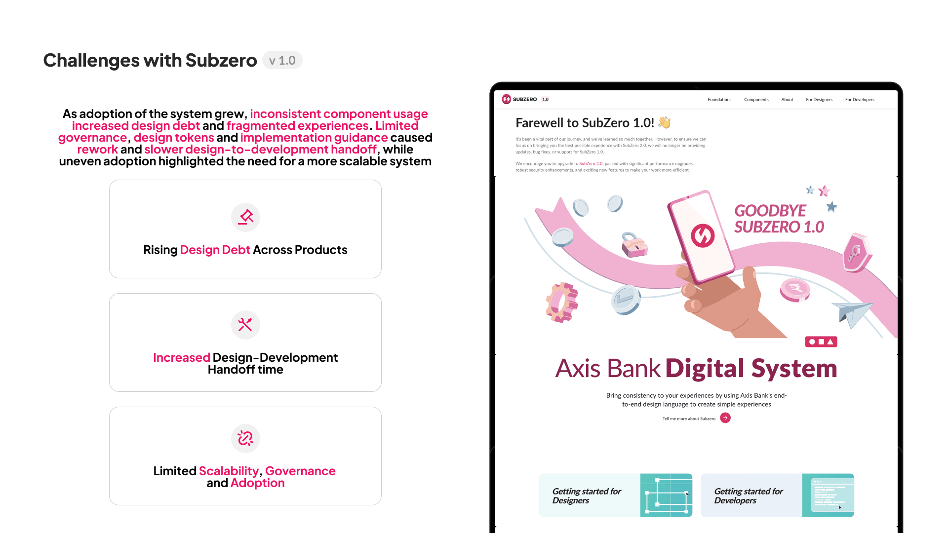
As adoption grew, audits revealed inconsistent component usage, design debt and fragmented handoffs. It became clear that scaling Subzero required more than components — we needed stronger documentation, governance and adoption processes.
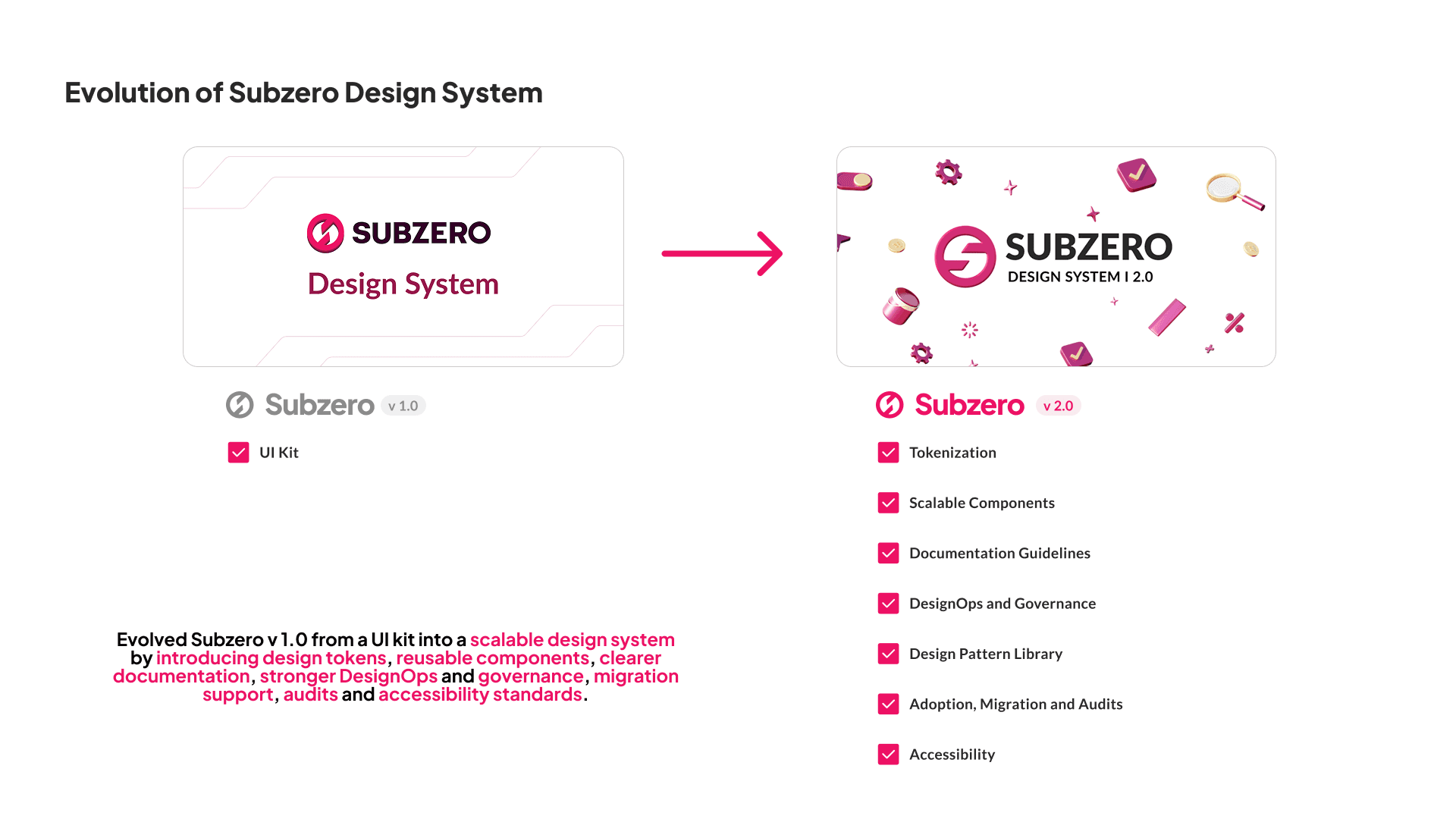
We evolved Subzero from a UI kit into a scalable design system with tokens, reusable components, documentation, accessibility standards and governance. The system was designed to make consistent patterns easier to find, use and implement.
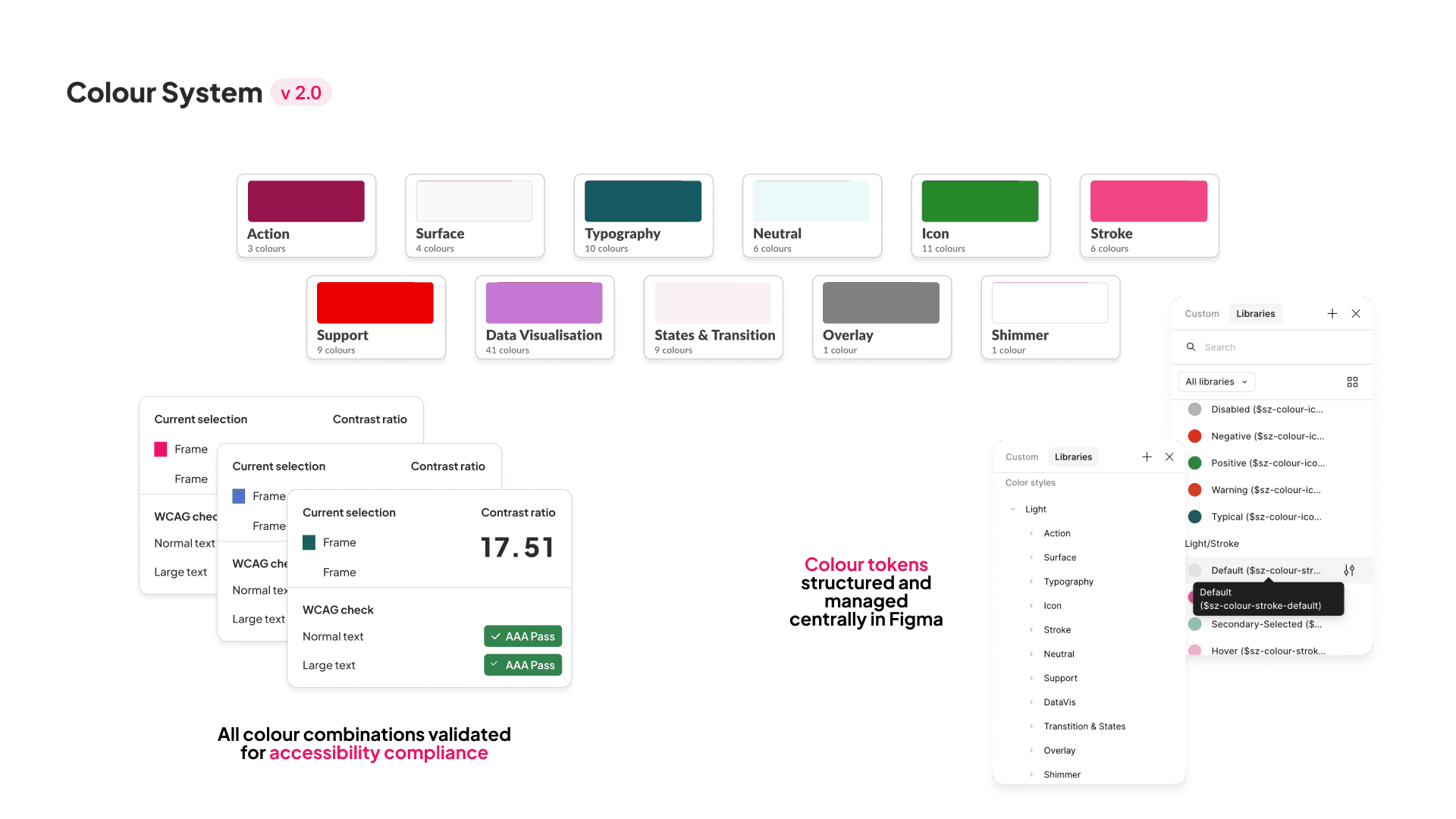
I helped structure colours around defined functional roles and centrally managed them in Figma. We also tested colour combinations against accessibility contrast requirements to create a consistent and accessible palette.
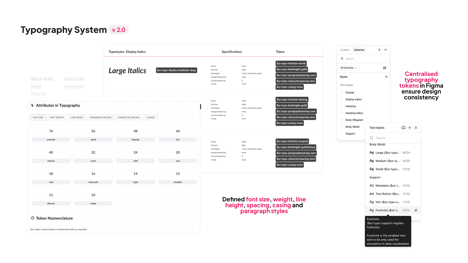
We created reusable typography styles covering size, weight, line height, spacing and hierarchy. Centralised tokens allowed typography decisions to remain consistent across components and products.
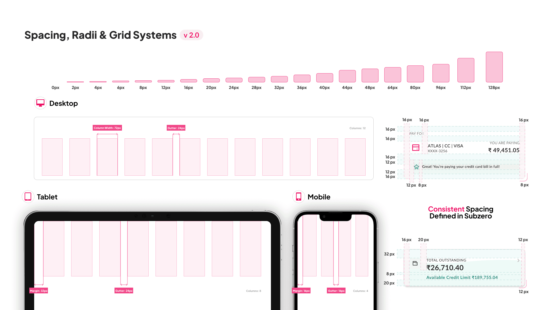
I helped establish shared spacing, radius and responsive grid rules across desktop, tablet and mobile. This reduced arbitrary layout decisions and created a common framework for designers and engineers.
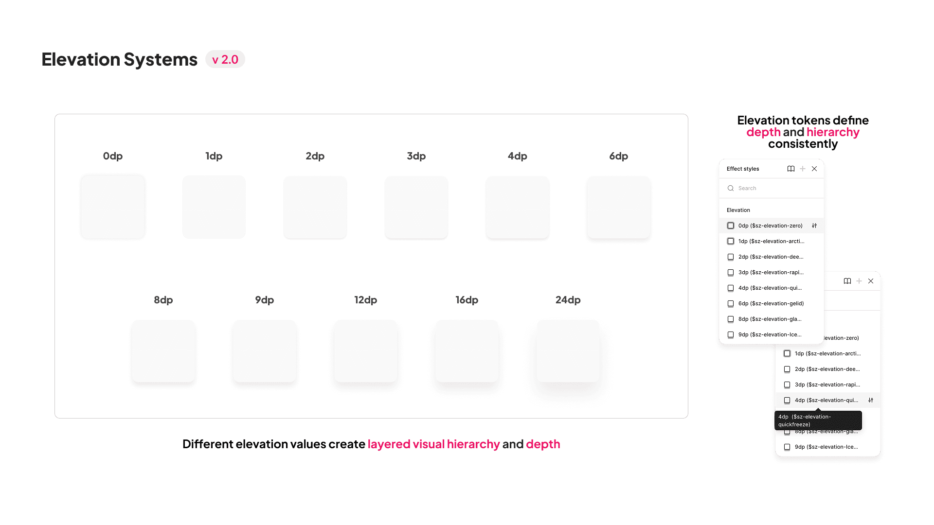
We defined reusable elevation values to communicate hierarchy and depth consistently. Instead of creating shadows independently, teams could select predefined levels based on an element’s purpose.
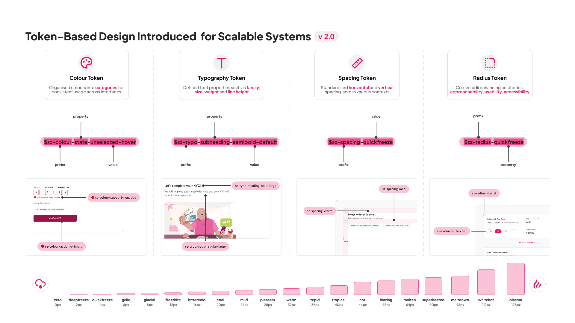
We introduced tokens for colour, typography, spacing and radius, turning foundational decisions into reusable system properties. This made the system easier to maintain and allowed changes to scale consistently across components.
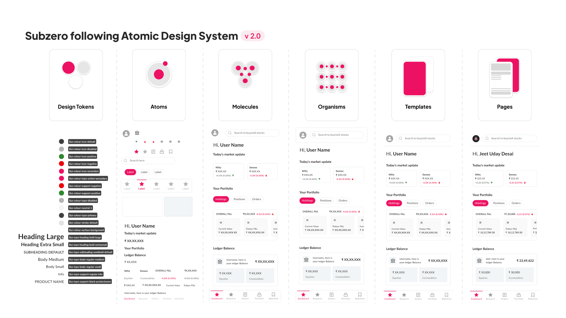
We structured Subzero using Atomic Design, moving from tokens and atoms to molecules, organisms, templates and pages. This created reusable building blocks that teams could combine into consistent experiences.
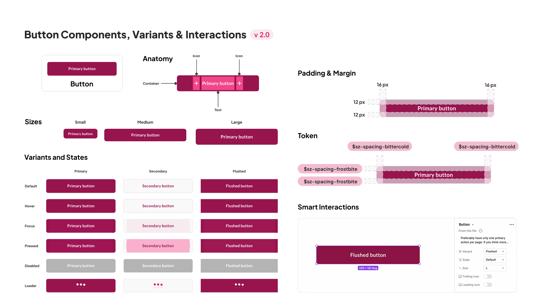
I worked on component anatomy, sizing, variants, states and interactions to support different product scenarios. Components were designed to be flexible enough to scale without teams repeatedly creating new patterns.
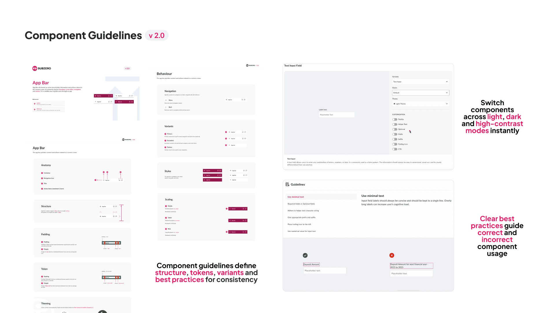
I contributed to guidelines covering component structure, variants, states, accessibility and best practices. This helped designers and engineers understand not only how a component worked, but when and why to use it.
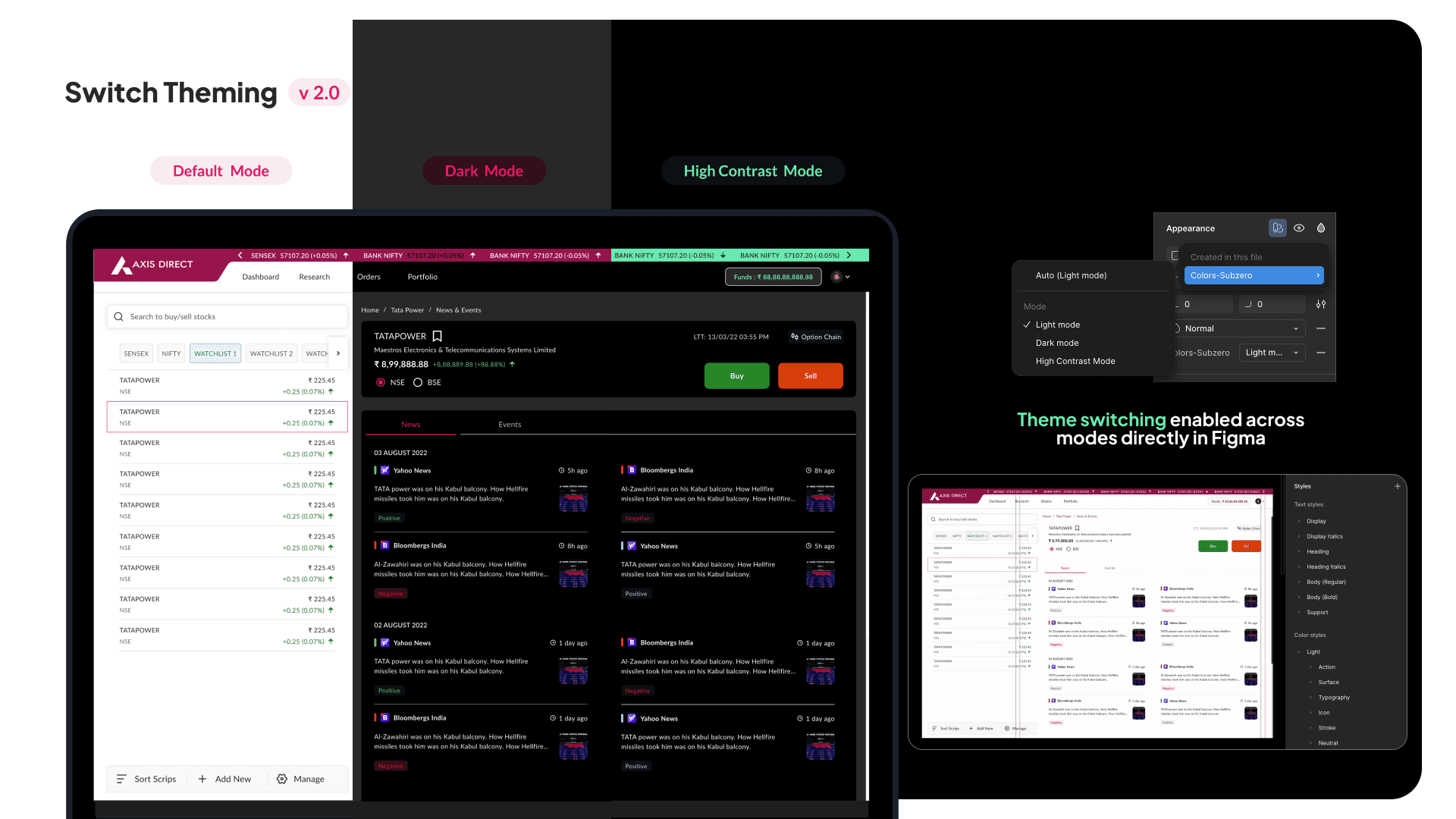
We extended components across default, dark and high-contrast modes using shared styles and tokens. This allowed teams to switch themes without rebuilding components and embedded accessibility into the system.
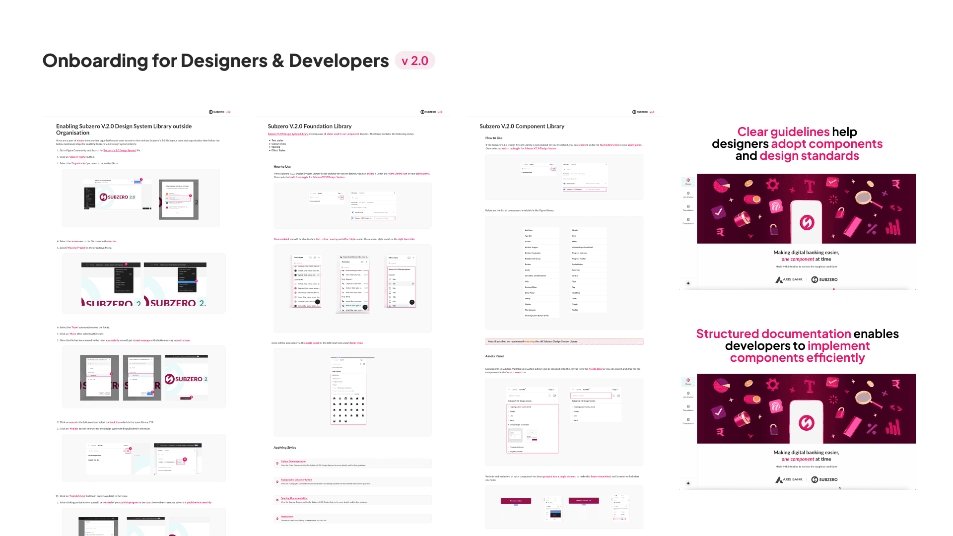
We created structured onboarding and documentation to help teams find, understand and implement Subzero correctly. This supported more consistent adoption across both design and development teams.
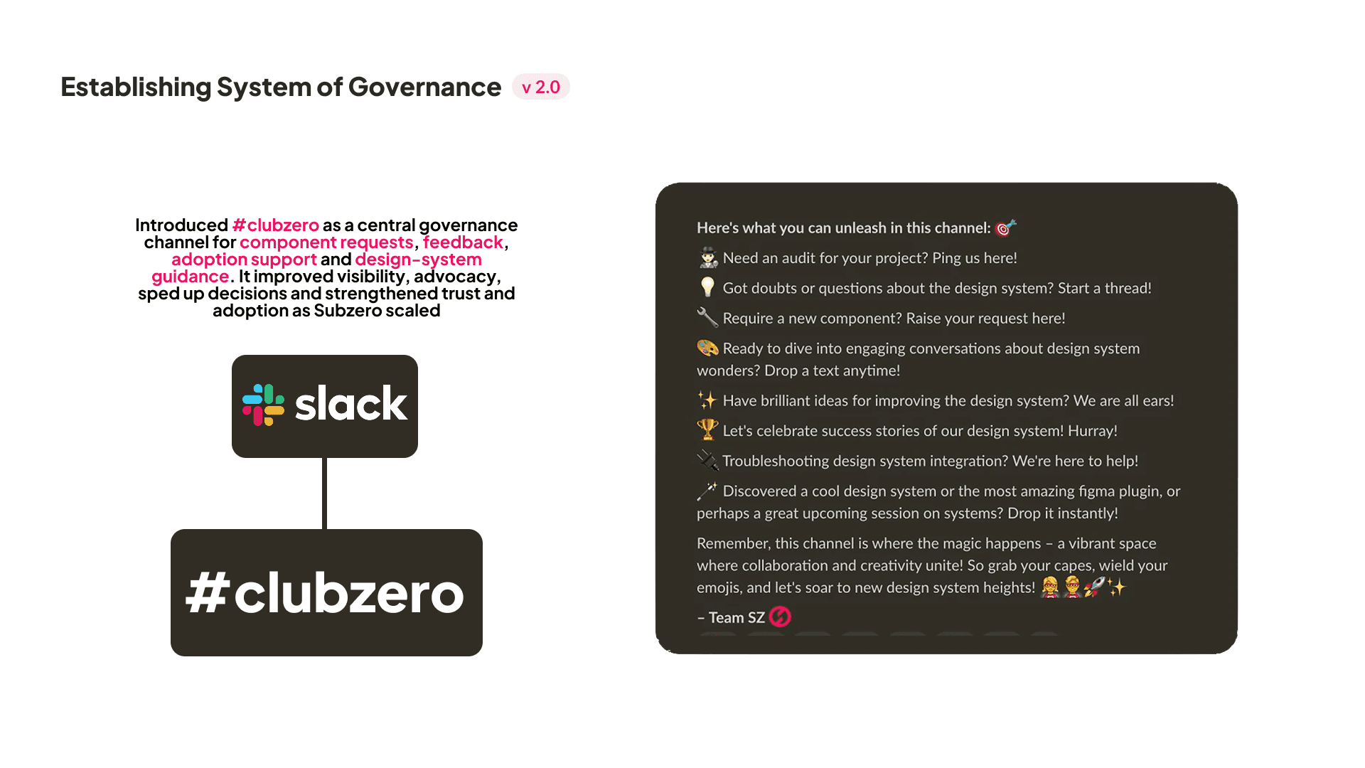
I helped establish #clubzero as a central space for component requests, feedback, questions and adoption support. These conversations also became a continuous research loop, revealing where the system needed to evolve.
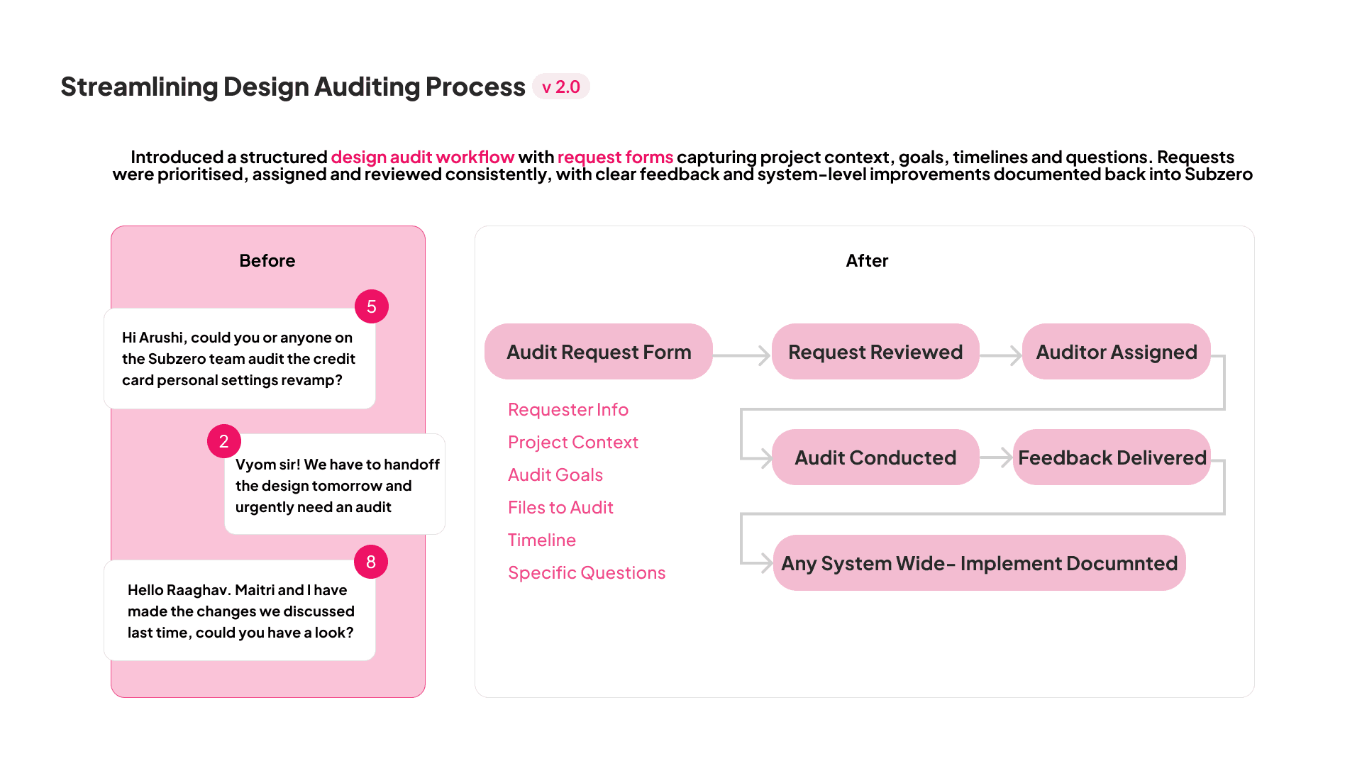
I helped replace ad-hoc audit requests with a structured workflow covering project context, goals, timelines and specific questions. Findings could then feed back into Subzero, turning individual audits into system-level improvements.
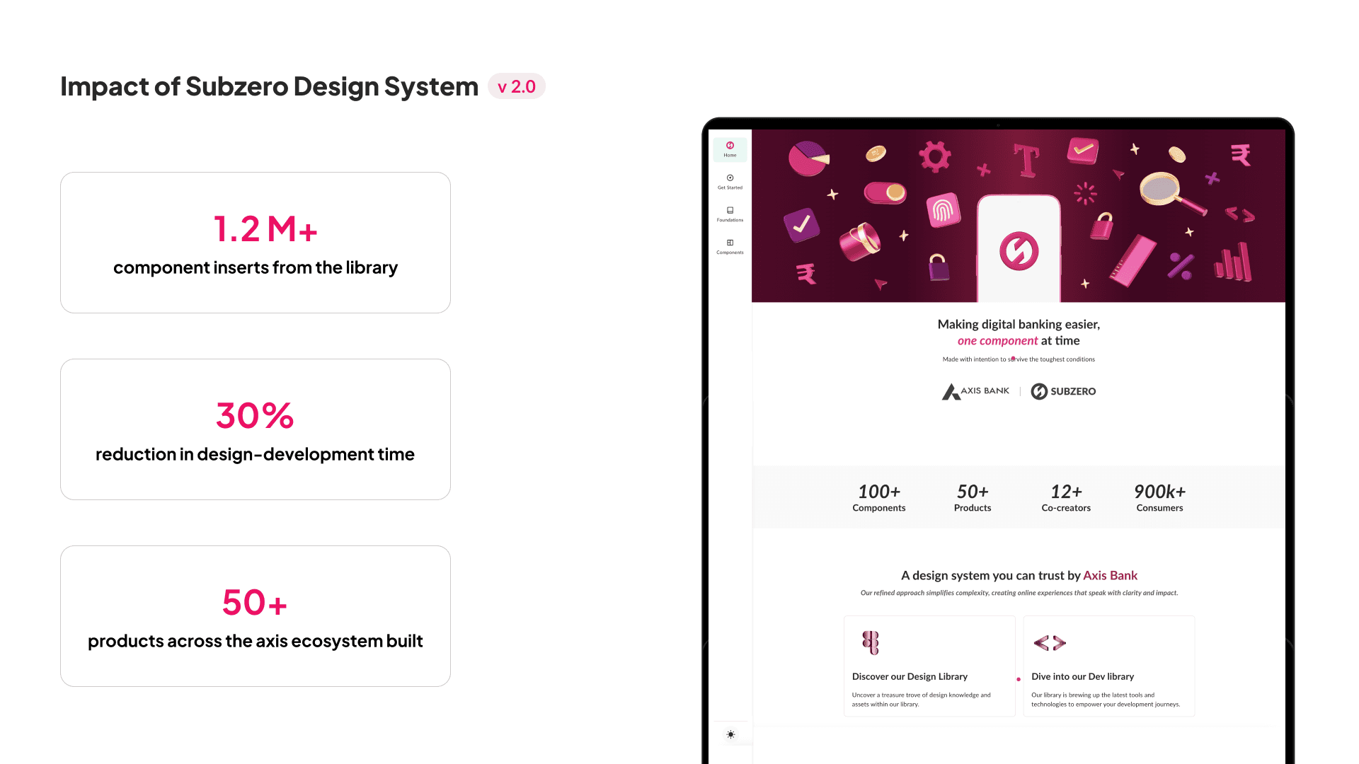
Subzero grew to support 100+ WCAG-compliant components across 50+ digital products, reducing organisational design debt and design-to-development handoff time by approximately 30%. It replaced fragmented patterns with a shared, scalable design language across product teams.
What I Learned
A design system is a product, not a library. Building components was only one part of the challenge. Research, documentation, governance and adoption were just as important to making Subzero work across teams.
Design debt grows when patterns lose consistency. Audits showed me how small deviations and duplicated solutions could accumulate across products. Creating shared foundations, tokens and components helped us address that debt systematically.
Governance keeps a system alive. As adoption grew, feedback, component requests and audits became an ongoing source of research. They helped us understand where the system was breaking down and what needed to evolve next.
The biggest learning was that a scalable design system is never really finished. It needs to learn from the teams using it, evolve with changing product needs and balance consistency with enough flexibility to work across different contexts.